The exercice is about typography hierarchy. I have to create text styles respecting the rules of the hierarchy and then apply them correctly in an article page. I don’t have any contraint on a number of text styles the font choice also.
To solve the exercice, I follow the step bellow.
1 I make research about the different type of font scale who exists (Golden ration, perfect fitht, perfect fourth, minor third, ...) in order to know if I can get something better.
2 I analyze both of them and make a choice. I decide to use the Minor Third Scale based on the fact it’s suit both on Desktop and Mobile interfaces.
3 Before jumping on create my scale, I proceed on font exploration. I choose Open Sans because of his good readeability, professional look and universal, these will be a positive point for the article page. The fact that is under an Open Font Licence can also facilitate the accesibility.
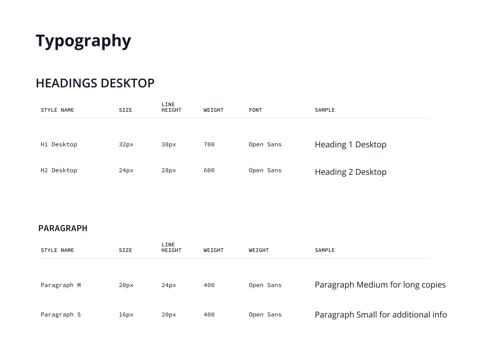
4 After this, I use the Type-Scale-A visual Calculator by Jeremy Church ( type-scale.com ) to calculate my font scale properties. As you can notice on my typographic scale, I rounded somes sizes in order to have a clear hierachy. It’s also good to have a whole, even numbers for sizes.
Lastly, I create style for each typographic scale on Figma and then I applied it to the article page.
As a result,I got a scalable typography table in addition to a consistency and well hierarchy article page. But before get there, the thing who really challenge me the choice of the most convenient type scale among all existing one